

The Context
In 2017, I started supporting the market leader of real estate portals, ImmoScout24. At that time, there was an outdated design library that nobody used and the design team was decentralized and without design standards.
The Problem
ImmoScout24 had a completely inconsistent design and the efficiency of the designers was very low because they neither worked with a library, nor had rules for UX patterns.
The Objective
Research, strategize, and build an accessible design system for all UX/UI designers, with a focus on increasing design efficiency dramatically.
The Plan
We had a really strict plan in the beginning:
Getting the buy in of the managers.
Creating an inventory of all elements and all colours.
Getting rid of all unnecessary elements and finding the elements that we really need.
Designing a clear and accessible color scale.
Building all components that we need with an atomic design approach.
Developing the components in code.
Back then we didn't have version control, since Sketch, Abstract and Figma, didn't work the way they do today.
Buy in
I created a very simple first draft of a design system with some basic elements, that we need for a simple page. Then I made a video of the design process without using a design system and a video after using a design system. I produced a side by side comparison of the videos in time lapse. Additionally to that I collected all the other advantages of design systems and put everything in a presentation.
With that presentation I pitched the creation of a design system to our company leaders and they were quite impressed and gave me the buy in. Yay!
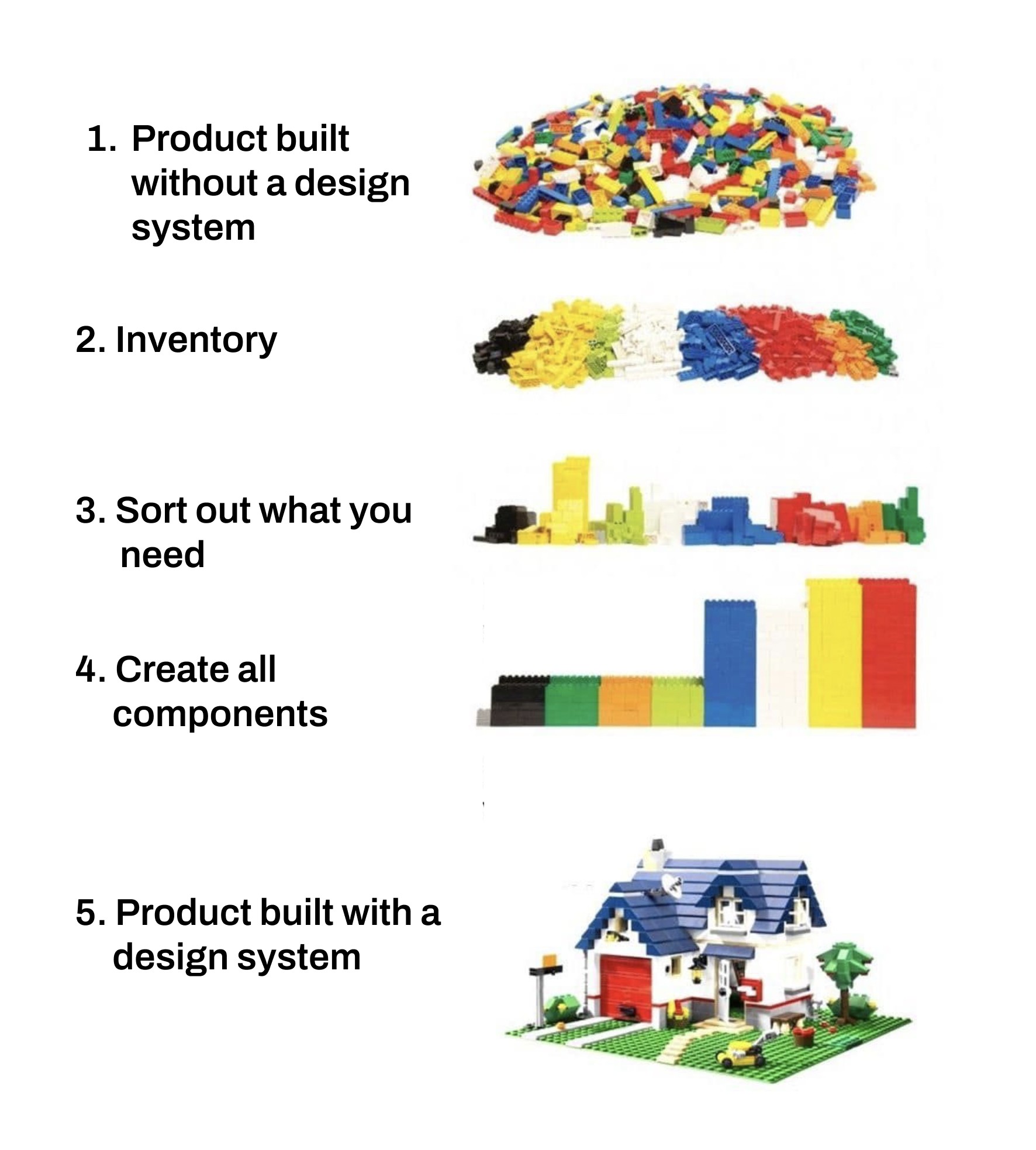
Inventory
The inventory was crazy especially with a company that is 20 years old and produced thousands of hard coded pages and countless CMS pages, without a design library. The design team and me crawled through a lot of pages and we collected everything that we could find, all colors, buttons, icons, dropdowns, navigations and so on.
In the end we had a massive collections of all elements and sorted them by topic. We figured out that we had more than 50 tones of blue, another 50 oranges and many more. I dont want to mention all the inconsistent UI components.
Clean up
After the inventory, we cleaned up all the colors and components. We deleted the ones that we didn't want to use any longer and kept the ones, that made sense.
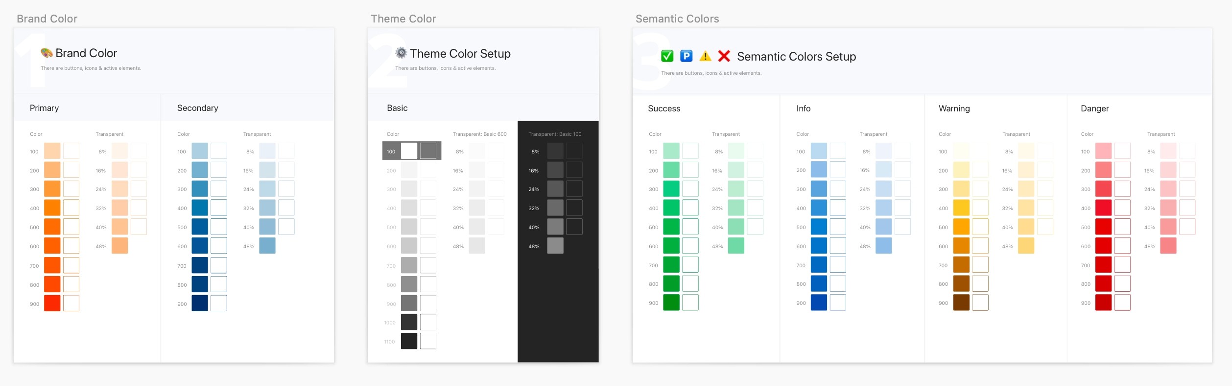
Color scale and accessibility
We knew what kind of colors we wanted to use, but did we have a great color scale yet? No. We needed to create a good scale, which was accessible. So we used some tools for getting the perfect color shades and tested them all for accessibility, until we had a perfect palette.
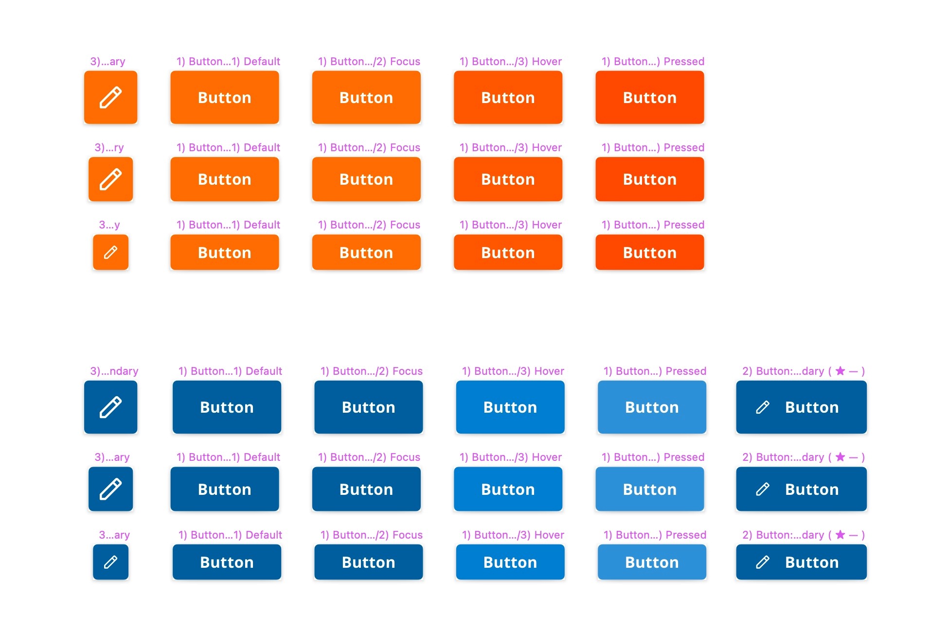
Atomic design components
We had the colors, now we needed the components. I read about atomic design, by Brad Frost, and started to create all the components with that approach together with my design team. First the basic elements (atoms) that we use all the time, like buttons and so on, then the more complex elements, that consist of the atoms, which are called molecules.
When we had a good basic library, we directly started working with them in our design, to check if they are working. The only big problem was, that the elements weren't saved in a cloud and they weren't well connected. No version control and nothing, but then Abstract popped up and I needed to get a buy in for that tool. This took a while but worked out perfectly and our little design system was more powerful than before.
Development
First there was one engineer and he developed all our components in CSS and React. We had a PM and she was dealing with all the communication between us and this worked perfectly. So if you want to create a design system, deal with it as a product, not as a project. It needs a permanent team (forever), with designers, engineers and a PM.
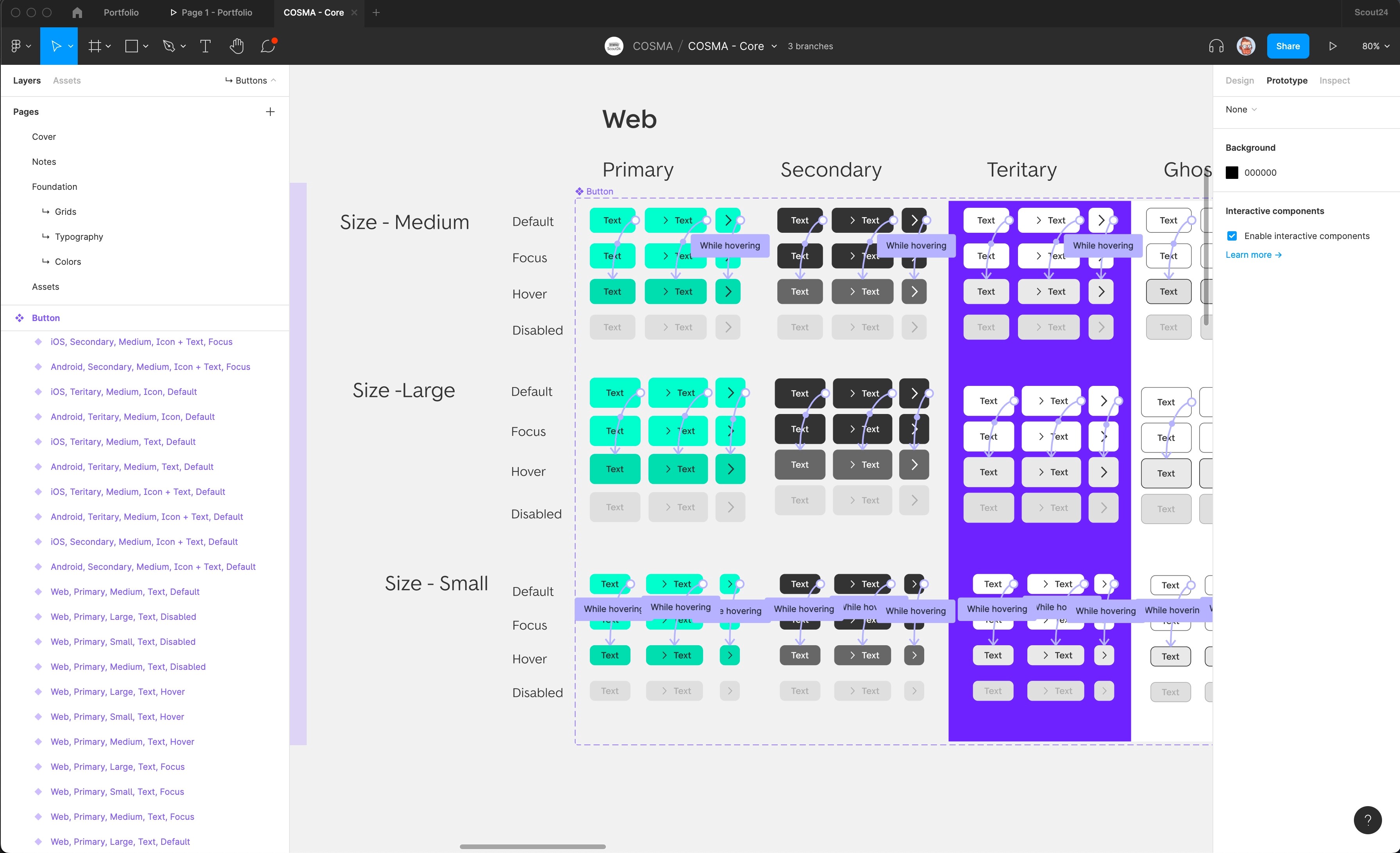
Our engineer added the components to storybook and slowly the other engineers were able to use our design system in our live product. That was really exciting!
The designers added more components and the engineers added them to the product and slowly more and more pages were built with the design system. It needed a lot of communication, a lot of back and forth, but it was a lot of fun too.
The ImmoScout24 Redesign
As if I knew before I started the Design System project, a major redesign project started in 2019. ImmoScout24 was to be completely redesigned. Colors, fonts and everything else. That was the moment for our new design system!
Of course the redesign was very complex, but through our design system we were able to implement it in record time in our UI.
The effort of the developers and designers was relatively low and we could work with consistent designs from the beginning. I'd like to know how much money ImmoScout24 saved on the redesign through the Design System, but it's hard to measure. It will have been a LOT, though.
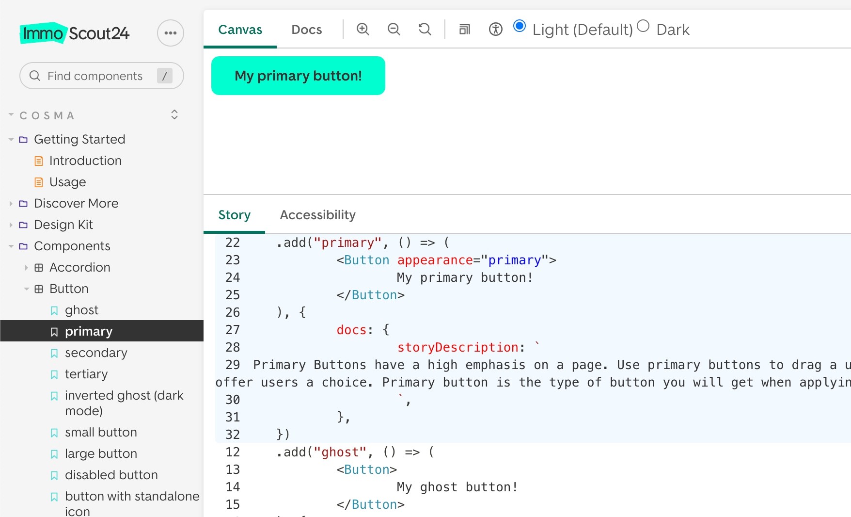
Today the ImmoScout24 design system is handled with Figma and it works like a charm for the web and all the apps.
Conclusion
To create a design system is a lot of work and it costs a lot of money, BUT if you're doing it right the return on invest is crazy. All designers and engineers are so much faster and can work on the things that are important. If there is a redesign upcoming, you can handle it with the speed of light and people love to work with a good design system. The most important things to consider are: It needs a permanent team, that is highly motivated to do dry, nerdy work sometimes and a design system needs to be handled as a product, that serves other products.
If you are looking for a designer to help you with your design system, drop me a line!